
Hand-Coded Portfolio Site
Introduction
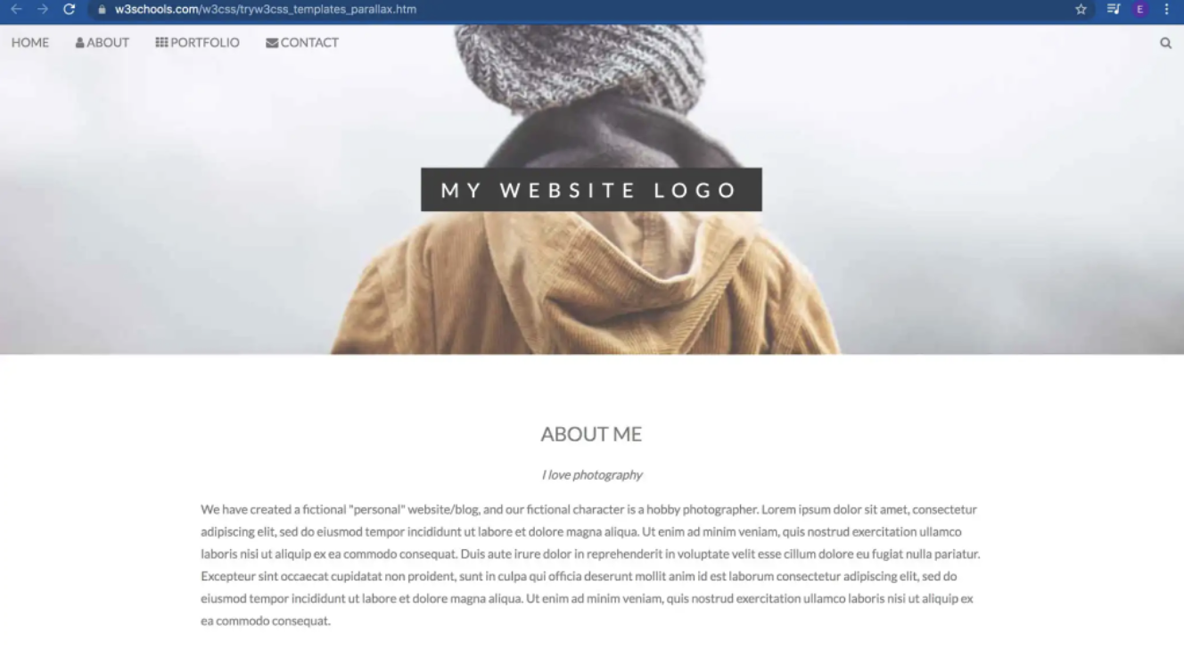
The Original W3schools template: Paralax
For this is hand-coded site, I started by choosing a theme from W3schools . This served as the framework and bones of my page. To the right is the template I began with.
Once I chose my template, I used the W3schools Tryit Editor which made it super quick and easy to alter the code any way I wanted and see immediate results.
Making my Plan
One part that is extremely helpful when coding and creating web pages, even from templates, is to have a game plan. I realized this the hard way. A long page of code becomes very overwhelming, very quickly.
After evaluating the template, I knew I wanted to keep most of the sections present on my final page. I deleted anything I knew I wouldn’t use. I also knew that I wanted at least one other color besides the grey, black, and white and to add a slideshow to highlight some of my work.
Header and Colors
I began with altering the header image and the accent color on my site. In my opinion, these were the easiest to change and were a good warm-up for the work ahead.
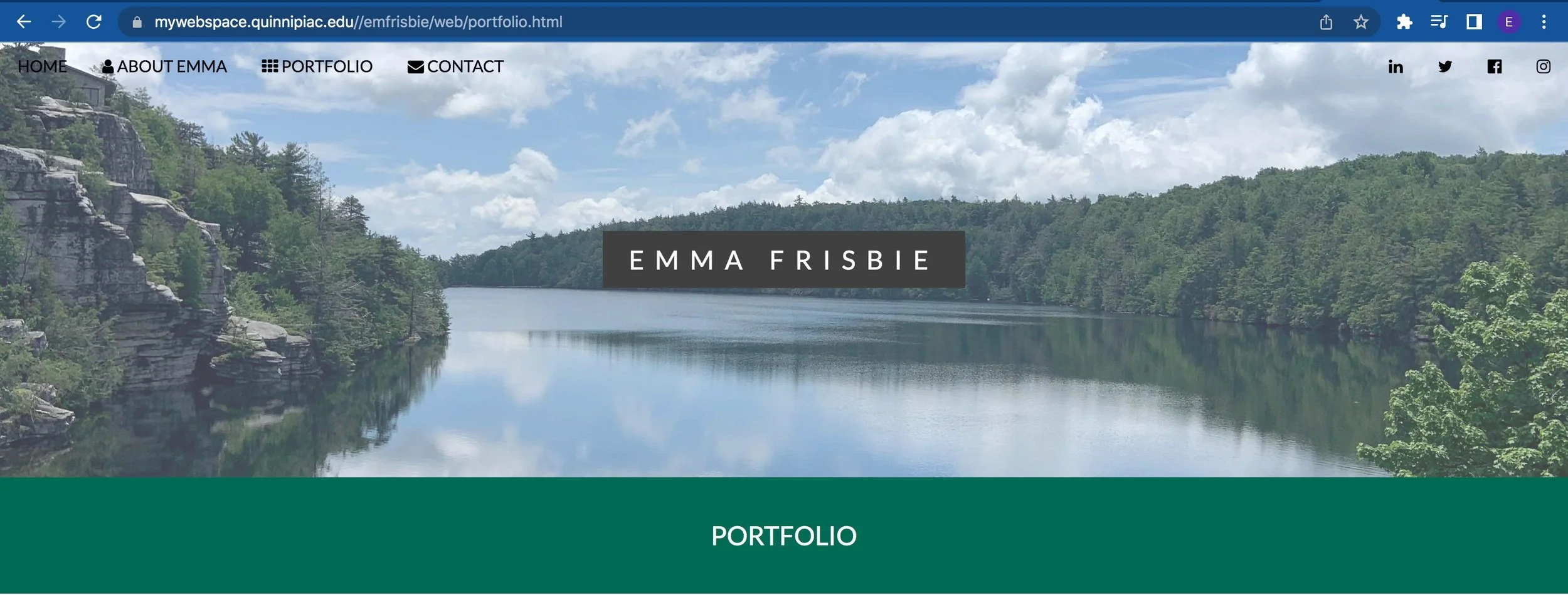
Page header and colors
I decided to use some . I also added separation between the header and the rest of my page. To access this color, I had to add a stylesheet I found on the W3schools website.
Navigation
I was already happy with the navigation bar provided on the template. But, I wanted to add a menu for my socials at the top as well. After implementing all the correct links, I wanted to add icons to the menu. This is where I discovered Font Awesome icons. They were super easy to add to the menu, too.
Socials Menu
My Work
Blog posts
For the “My Work” section, I wanted to showcase some of my most popular blog posts. I began by removing the original images and inserted the featured images on the posts. Then, underneath each image, I added hyperlinked text to that article.

Most popular blog posts section
Slideshow
An aspect that didn’t come with the template was a slideshow. So, I again looked up the code for implementing one on W3schools.

Slideshow of my work
It used a combination of HTML, CSS, and Javascript. Once I pasted it, it took a bit of trial and error to achieve the look I wanted. It began off-center and overlapping other sections. But, after adding margins and adjusting the placement, it turned out perfect.
THE “WHAT I DO” SECTION
One section that I liked was the “what I do” section. It was a unique way to showcase my skills. I altered the colors and added percentages for my skills.

“What I do” section
About and Contact
The about and contact sections were pretty straightforward. I knew I wanted to keep both and have them both towards the bottom of the page.
In the template, the about section is quite long, so I shortened it, moved it to the bottom, and added my picture. I did a similar process with the contact section.
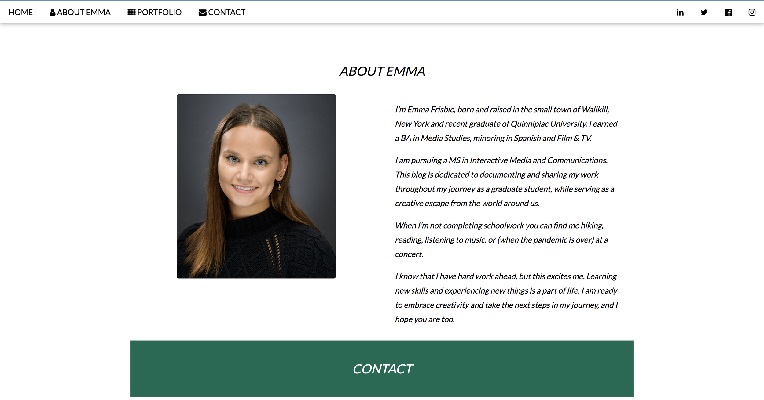
The “About Emma” section