
Logo for Robyn Koons
Robyn Koons is a licensed CT real estate agent based in the Wallingford, North Haven, and Yalesville areas. As a new agent under Century 21, she was looking for a way to stand out and introduce herself to the community.
Logo Goals
The main goal of this logo is to create a sense of branding and identity for Robyn and her work. After looking at some inspiration and some discussion we decided on the following goals for the logo:
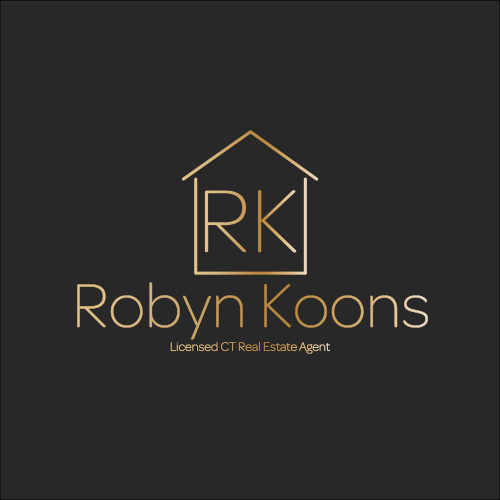
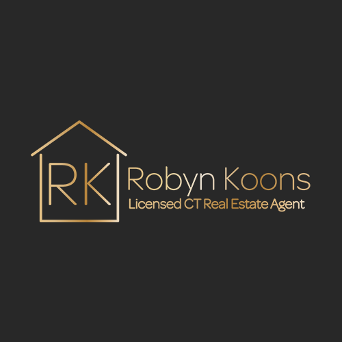
House with “RK” initials underneath the roof
Gold logo with a charcoal/dark background
Create space to add/remove her full name and title as needed (Robyn Koons, Licensed CT Real Estate Agent)
Must have different versions of the logo for different: Gold, black, and white
Must appear on flyers, website, and business cards
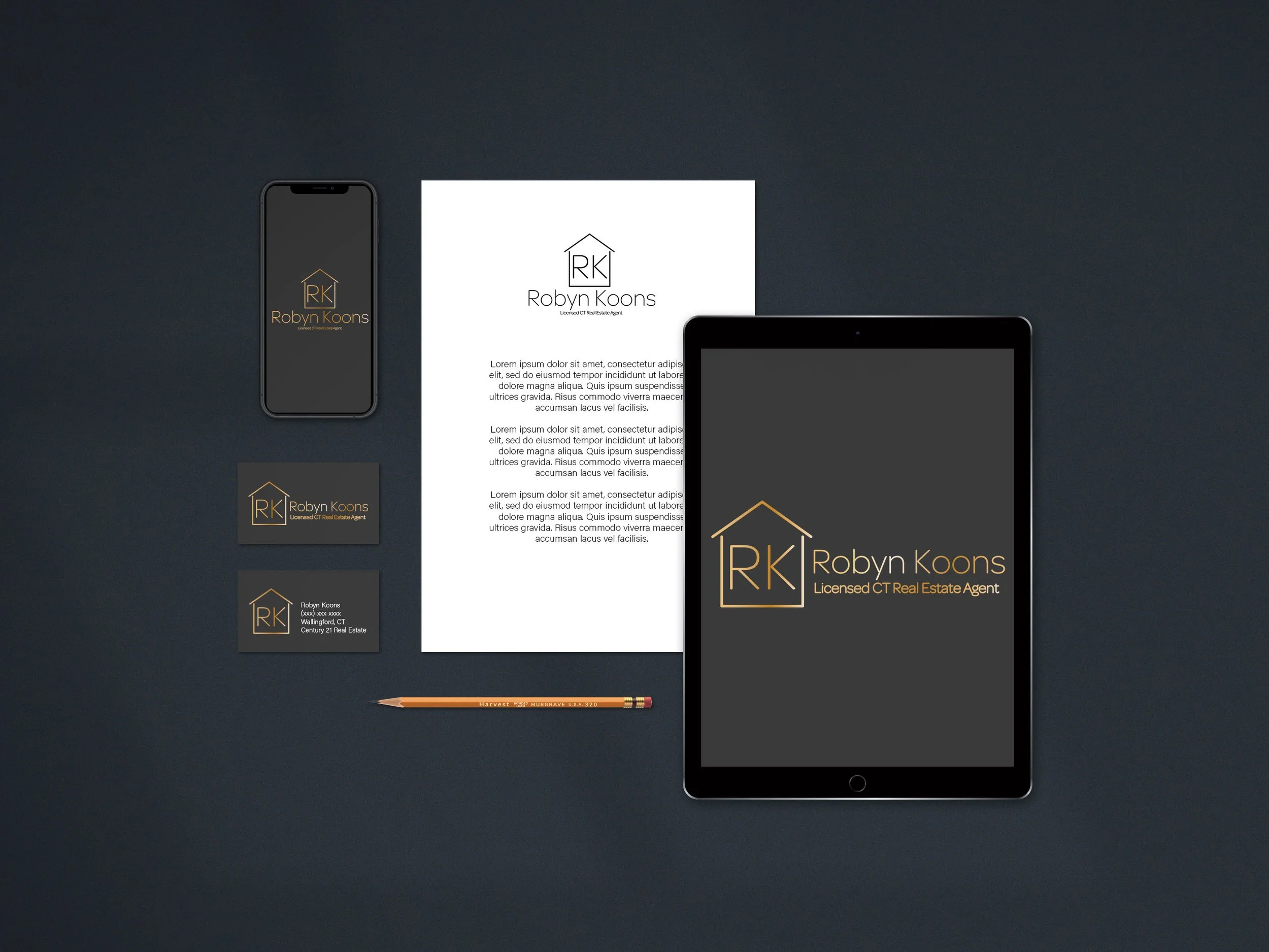
Final Design
After multiple versions, discussions, and edits we landed on two different layouts for the logo. We found that the vertical logo, on the left, worked better for flyers and other portrait-orientated assets. The horizontal layout, on the right, worked better for business cards and landscape-oriented materials.
In addition to the different layouts of the logo, I also included versions in white and black that will stand out on any color background and work in any assets.


